Bridge addresses challenges like misunderstandings, slow response times and discomfort in sharing devices, making interactions more natural and efficient. In less than 3 months, I led the product from ideation to development. My contributions resulted in:
The Problem
Individuals who don’t use their voice encounter challenges in face-to-face conversations.
Slow Responses
Typing out responses takes time, leading to unnatural conversations and misunderstandings.
Sharing Devices
Many individuals feel uncomfortable handing their personal devices to strangers to communicate.
Emotional Strain
Individuals feel frustration, a lack of confidence, and feelings of isolation during in-person conversations.
Background
It started with a comedy show.
While I was watching Kill Tony, I saw a comedian who couldn't use his voice due to a medical condition and relied on a text-to-speech app to talk. It was clear that the delay from typing responses disrupted the flow of the conversation, resulting in some confusion and misunderstandings. This sparked the question:
”How can we make conversations easier for those who don’t use their voice?”
Our Team
The project began with me and a researcher.
I was part of an Incubation team, tasked with finding new opportunities for the company. What began as a two-person effort grew into a collaborative team that included a product manager, two developers, a researcher, and myself as the sole designer.
Our Hypothesis
Individuals who don’t use their voice face challenges in conversations.
Research
We focused on the deaf community.
This demographic aligned with the company’s mission and included a user base of over 50,000 active users - giving us direct access to people to engage with.
The researcher and I put together a survey to uncover key insights, ensuring the questions were unbiased and actionable. After multiple iterations, we launched the survey using Maze and reached out to over 70 participants.

Validating Our Hypothesis
Our goal wasn't only to validate our hypothesis but also understand the problem’s impact to determine if it was truly worth solving. From 55 responses, here are the key takeaways:
56%
Engage in face-to-face conversations daily
An additional 27% engage a few times a week. This showed the problem had the potential to impact many lives frequently.
78%
Feel discomfort during conversations
When asked to describe difficulties during conversations, users reported feeling misunderstood, discomfort, and being excluded or “set aside.”
84%
Identified unmet needs
Participants revealed their current tools like Cardzilla and Notes didn’t address their needs, creating an opportunity for an better solution.
We identified unsolved problems.
After analyzing competitors and diving deeper into challenges, we identified high-impact problems that existing tools failed to solve. Solving these problems became a clear opportunity to set us apart from competitors.
73%
Felt discomfort sharing personal devices to communicate.
58%
Said typing responses disrupted the flow of conversations
Design
Creating a Private Experience
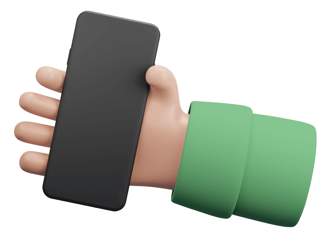
For many users, handing over their personal device to have a conversation felt intrusive and uncomfortable. Makes sense, right? I needed to remove this step while maintaining the natural flow of the conversation.
73% of users felt discomfort sharing personal devices
Handing their phone to strangers for communication created privacy concerns and emotional unease, disrupting the flow of conversations.
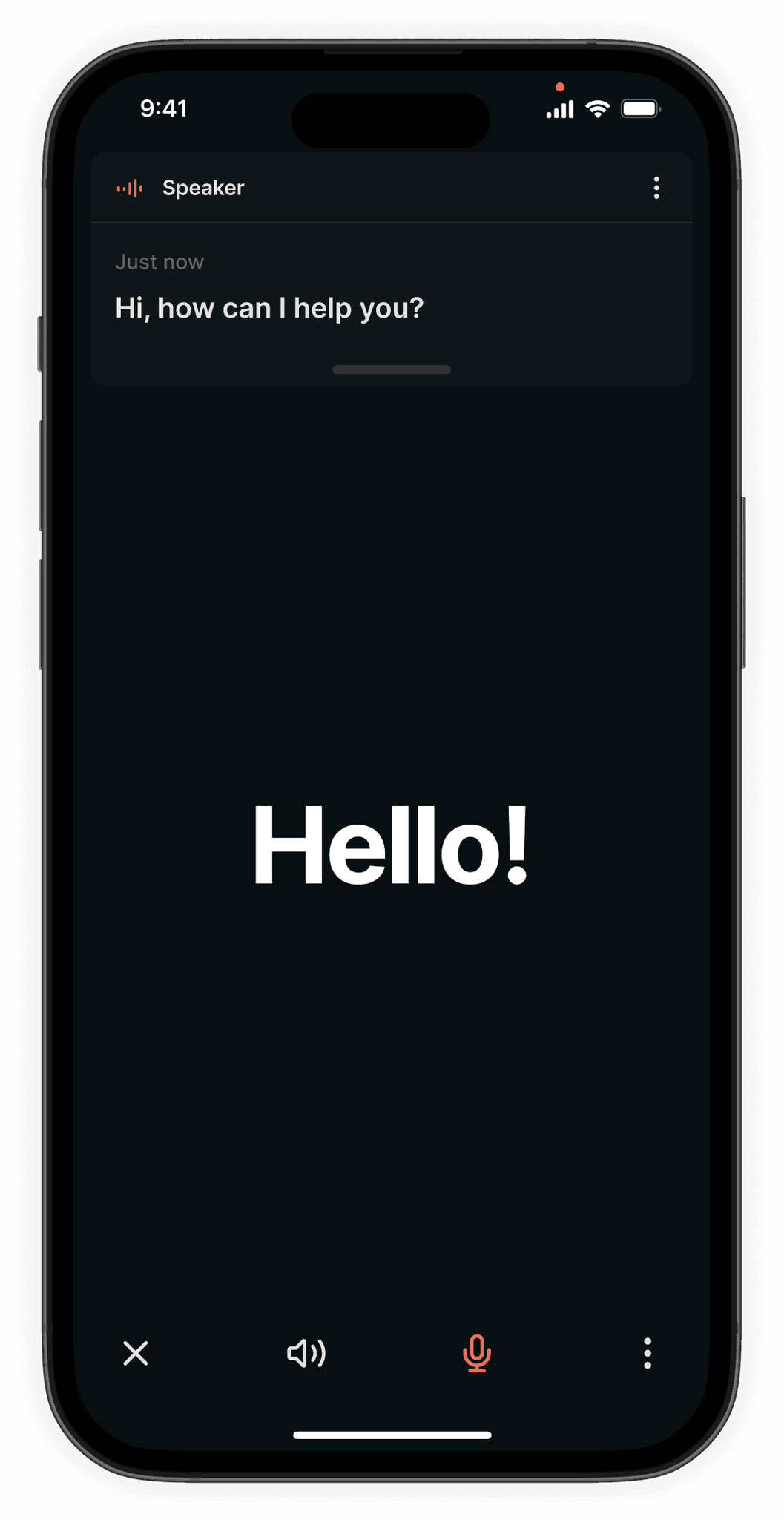
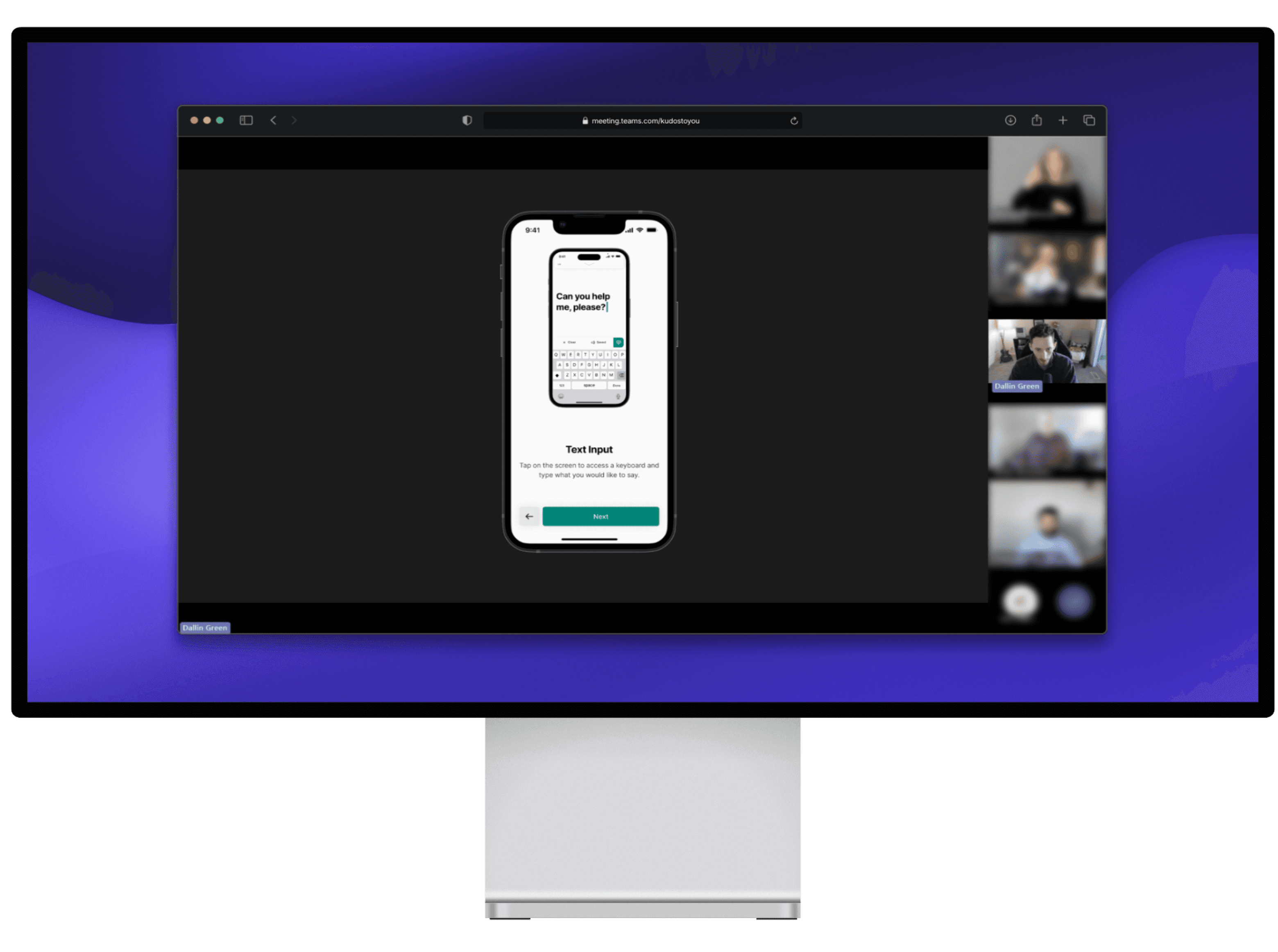
I focused on designing a layout that kept primary information in clear focus. Users needed to see both what they said and what others were saying without switching context or dealing with distractions. This meant prioritizing information hierarchy and minimizing visual noise to support seamless, two-way communication.
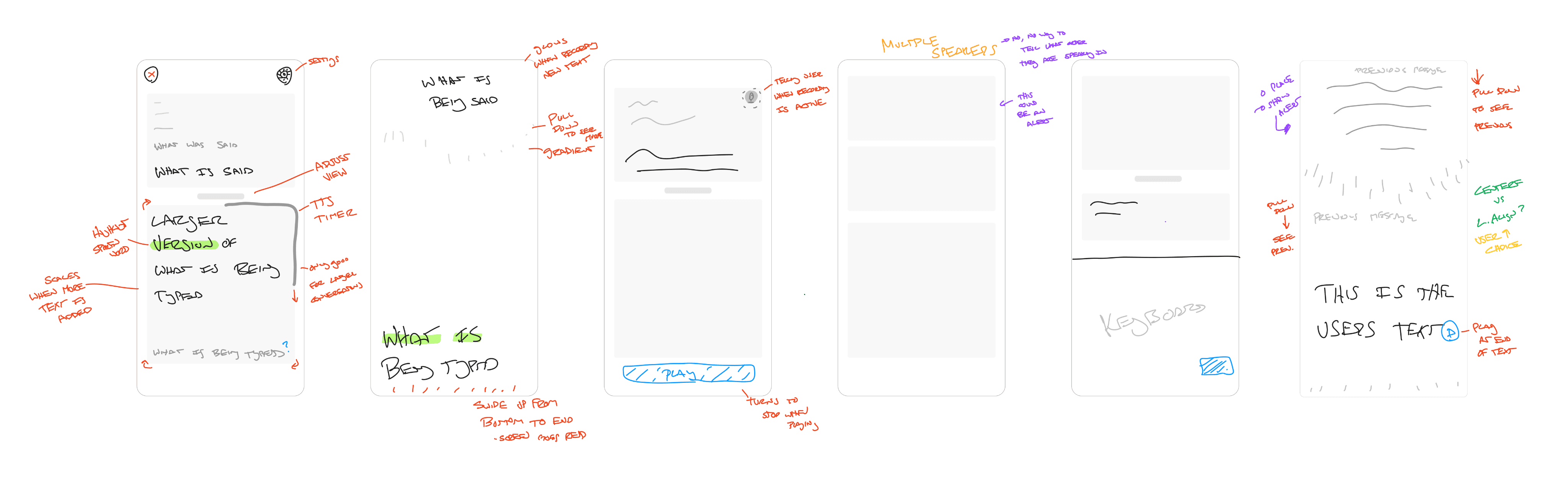
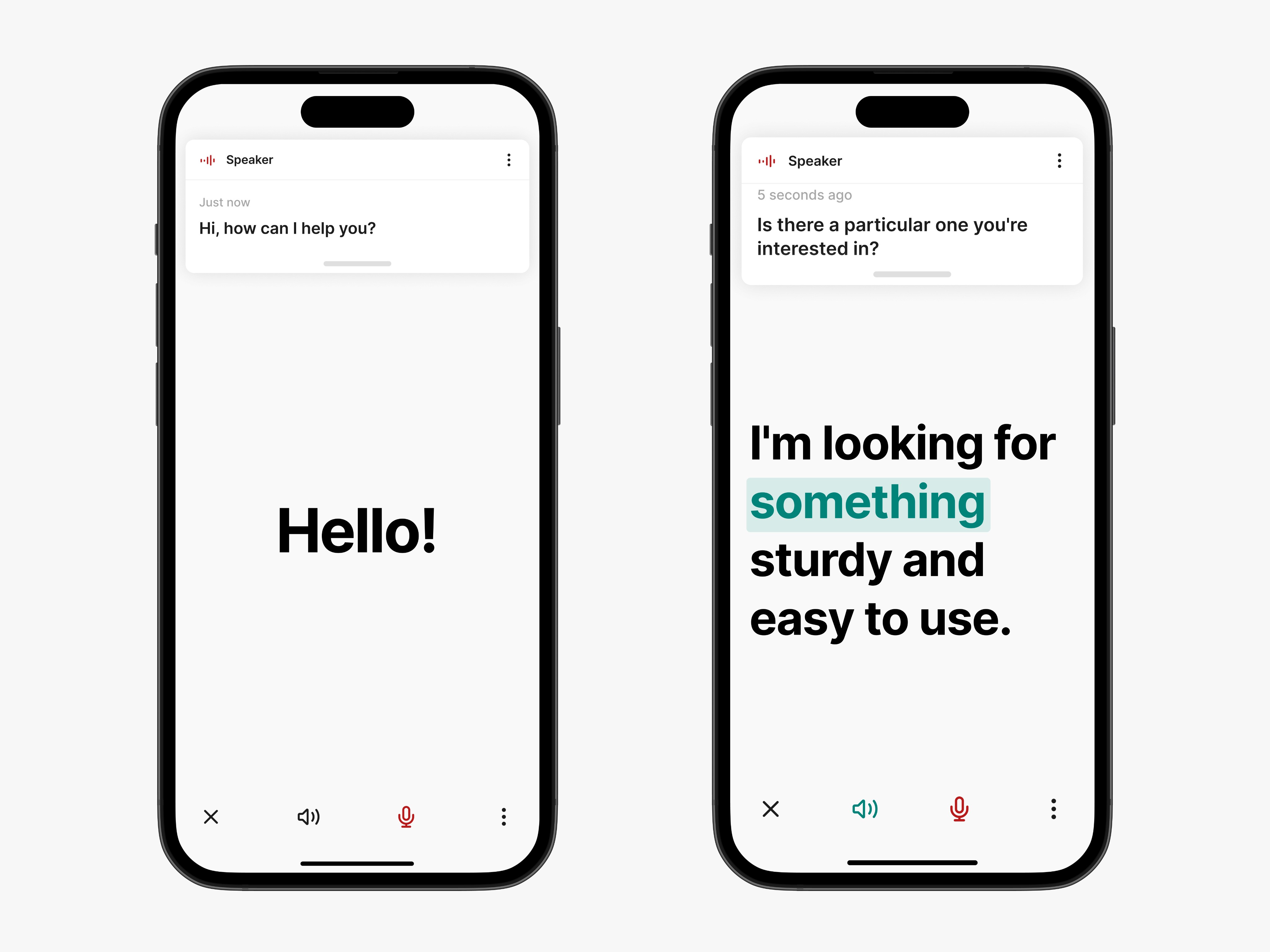
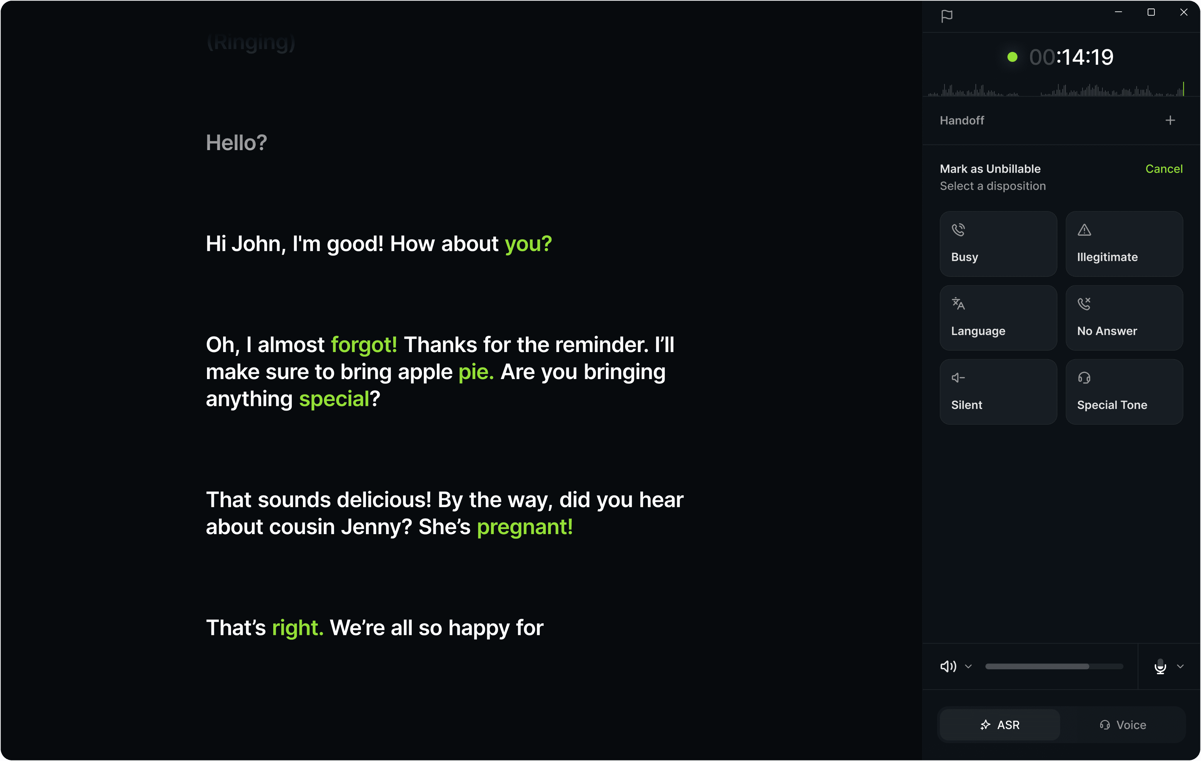
The result was a dual-text interface where users could type their responses and capture the other person’s speech using their microphone. The speaker’s words appeared in a separate section, maintaining clarity and privacy in the conversation.
Speeding Up Response Times
Typing responses often slowed down conversations, creating a significant barrier to natural interaction. We needed to empower users to communicate faster while preserving clarity.
58% of users said typing disrupted the flow of conversations
Slow response times caused by typing on phones led to unnatural and frustrating interactions, reducing engagement and fluidity.
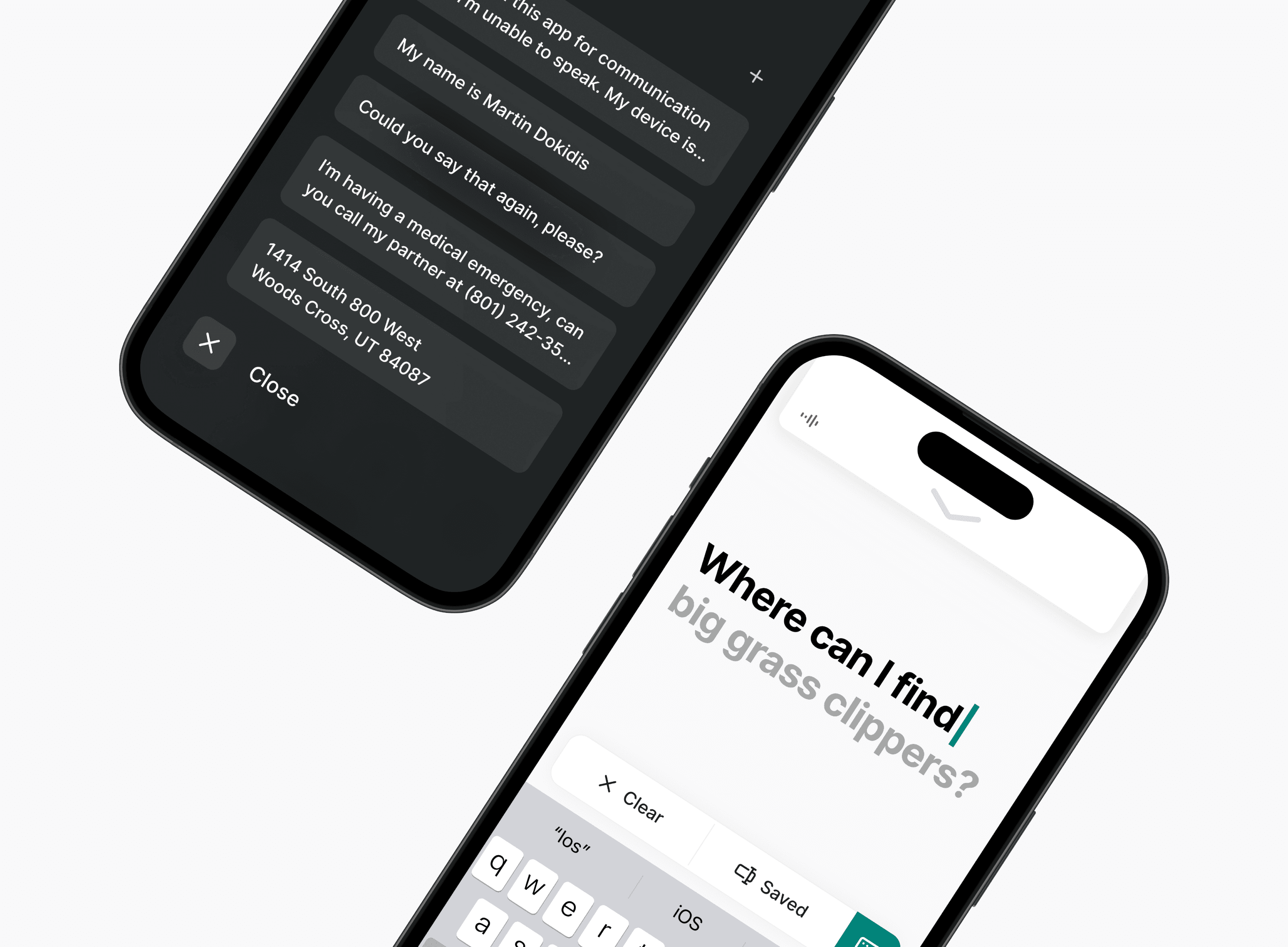
We often repeat ourselves in conversations - whether it’s sharing your address, phone number, or even a Starbucks order. Typing those things out can be tedious and, at times, frustrating. This felt like an opportunity to streamline the experience by building in features that could reduce that repetitive effort.
This lead to two key features:
01
Smart Suggestions predicting responses based on conversation context.
02
Saved Text allowing users to quickly access and reuse common phrases.
These features would reduce response time, making conversations feel more natural. Users could stay engaged without the frustration of typing every word from scratch.
Testing
We conducted usability testing to validate our solutions and uncover areas for improvement.
Unclear Captions
Participants found it unclear whose text belonged to whom and wished they could view both sides of the conversation, similar to a text thread.
“I’m not sure who said that?”
Confusing Icons
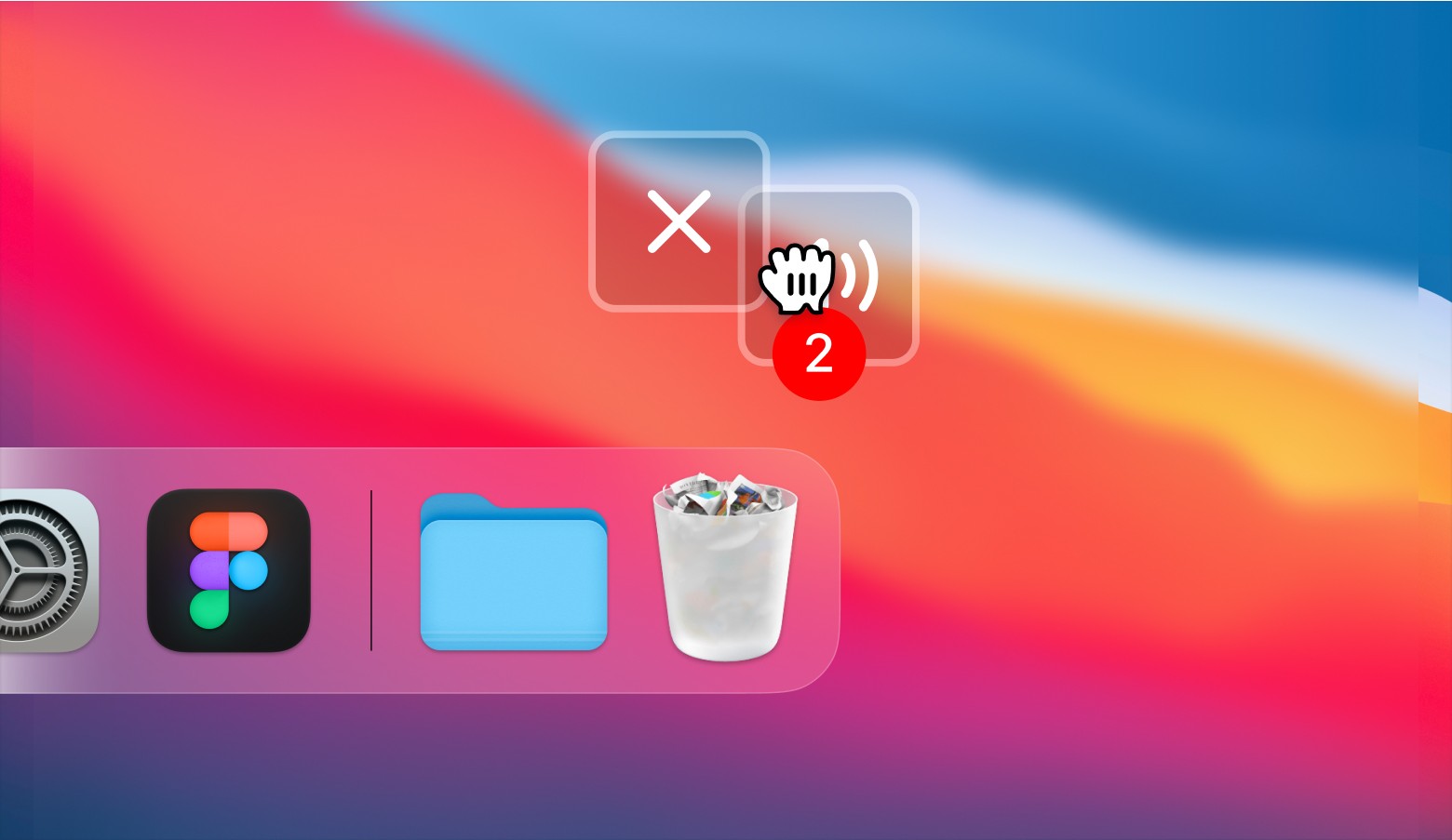
Participants frequently misinterpreted action bar icons. For example, many thought the close icon was for clearing text or the TTS action was for volume control.
“This [icon] looks like it’s for volume or sound.”
Overall Enthusiasm
87% said they would use Bridge in their daily lives. Many described it as the kind of tool they’d been waiting for but had never seen before.
“This is a big game changer.”
Back to the Drawing Board
After testing, we felt confident we were on the right track and tackling a real problem, but there was still more work to be done. We made the following updates to refine the experience:
New Captions
Redesigned the speaker box into an SMS-style chat layout with diarization, making it easy to track both user and speaker contributions.
Clearer Icons
Replaced the “close” icon with a logout icon to reduce confusion and updated the text-to-speech icon to a play button for improved clarity.
Validating Updates
After making changes based on feedback, we wanted to ensure they were effective and further validate the concept. So, we reintroduced the updated prototype with the refinements. Here’s what we found:
Action Bar Improvements
Participants immediately understood the updated icons, reducing confusion and increasing decision making time.
Running Dialogue Success
Users found the SMS-style layout intuitive and appreciated the ability to track previous messages.
Overall Adoption
Users were excited! Feedback included things like “when can I start using this?” and “this would make my life so much easier.”
Building Support and Expanding the Team
To gather support, I presented Bridge and our findings to leadership and an audience of approximately 150 people from various departments.
Seeing Bridge in action sparked enthusiasm across departments, with many teams eager to contribute to its growth. The presentation, combined with conversations with stakeholders, helped the team secure a dedicated product manager and two developers to move the product forward.
Results
Around a month after development began, the company underwent a major restructure.
The Incubation team was dissolved and redirected to focus solely on improving existing tools rather than creating new solutions for unsolved problems.
It was a tough blow. Bridge felt like a product that could genuinely make a difference in people’s lives. But this is part of the job - balancing user needs with company objectives. That didn’t mean I gave up. Even now, I continue to bring up Bridge in conversations with other teams, hoping to reignite the momentum we had and breathe life back into the project.
Even though its development was halted, the potential impact of Bridge didn’t go unnoticed. In the months that followed - and even now - I still get messages from coworkers asking, “What’s the status of Bridge?” or “Can I try it out?”

Where can I download Bridge?

Hey, what’s up with the Bridge app?

I can’t find Bridge in the app store.

Reflection
Bridge started with a simple observation and grew into a full-fledged product.
If I could do it all over again, I’d push harder for alignment on the value of Bridge. Bridge showed the power of solving for real user needs, and I believe a stronger business case might have helped keep it alive.
Despite its early end, Bridge made an impact. Its influence lives on, and so does my hope that one day, Bridge will find its way into the hands of users who need it most.