Nameless
Rebuilding the design system to improve accessibility and scale across 30+ products
Lead UX Designer
2 Months
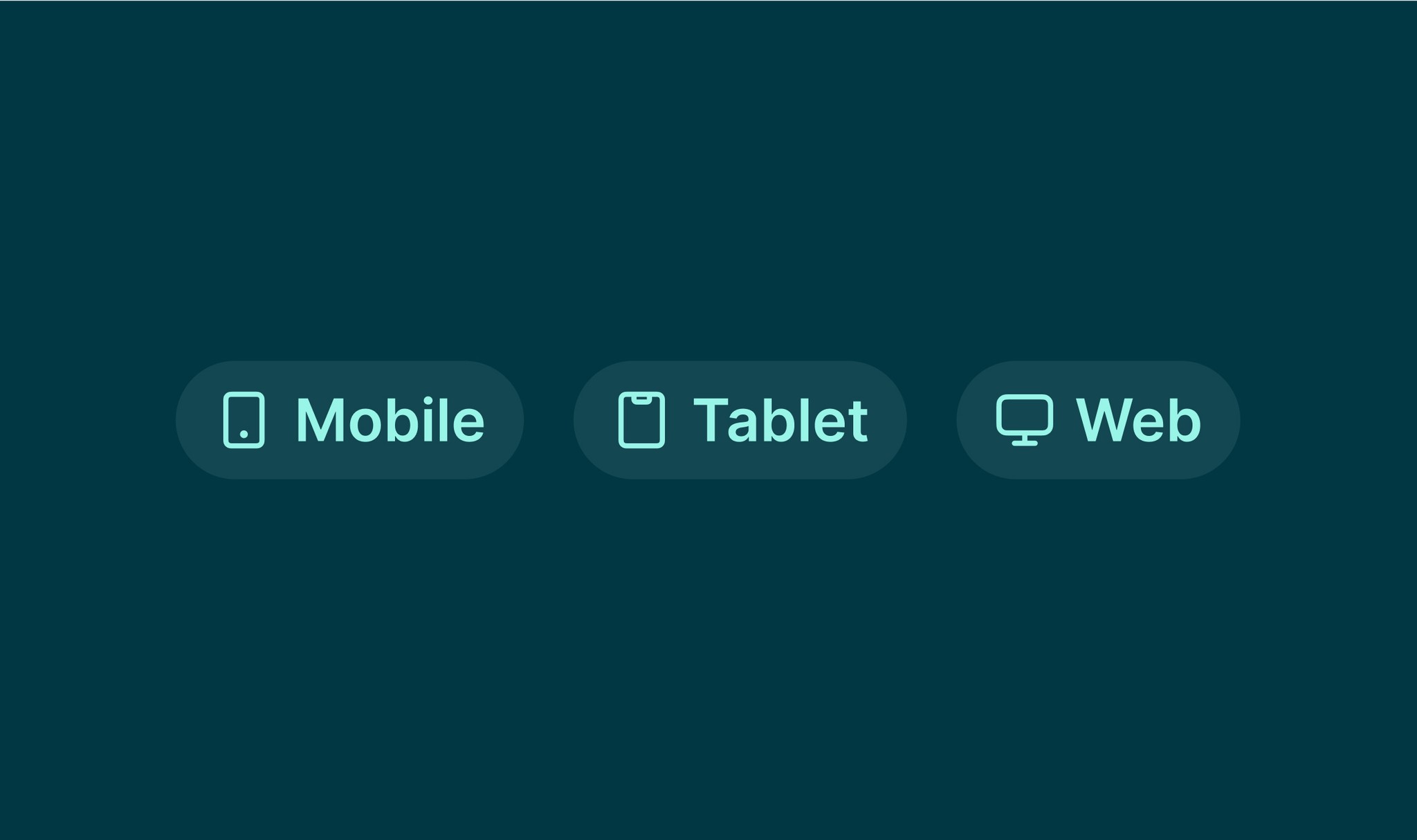
Web + Mobile + TV
The original system was undocumented, inaccessible, and used inconsistently. I inherited ownership and led a full redesign, grounded in actual usage, accessibility needs, and cross-functional input.
The Problem
The design system lacked accessibility, documentation, and scalable patterns - leading to rework, inconsistency, and higher costs.
Designers
7-10
Detaching and overriding to meet needs slowed work, increased inconsistency, and added design debt.
Developers
100-150
Faced inconsistent components and unclear documentation, leading to rework and longer implementation times.
Users
1M+
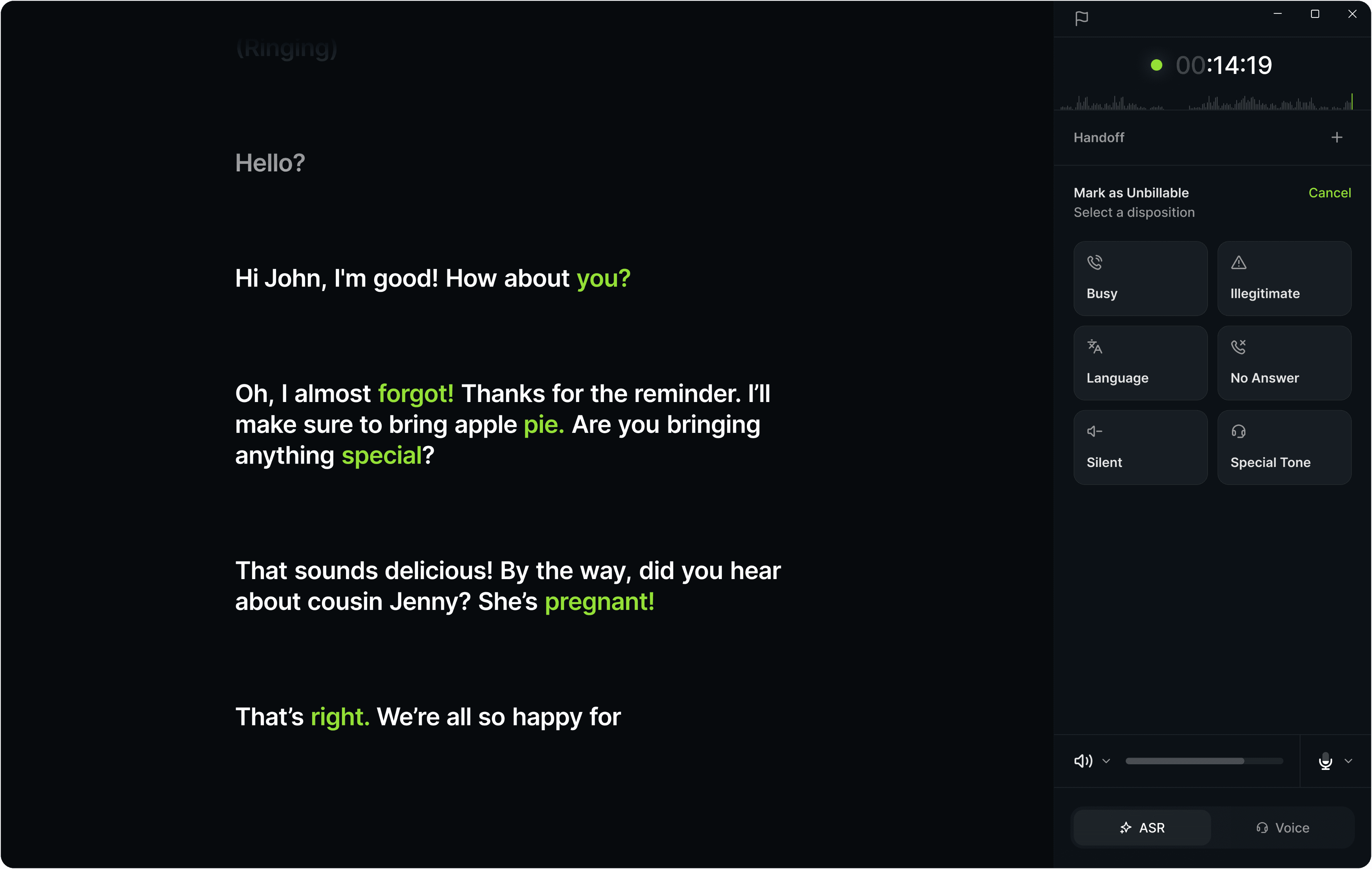
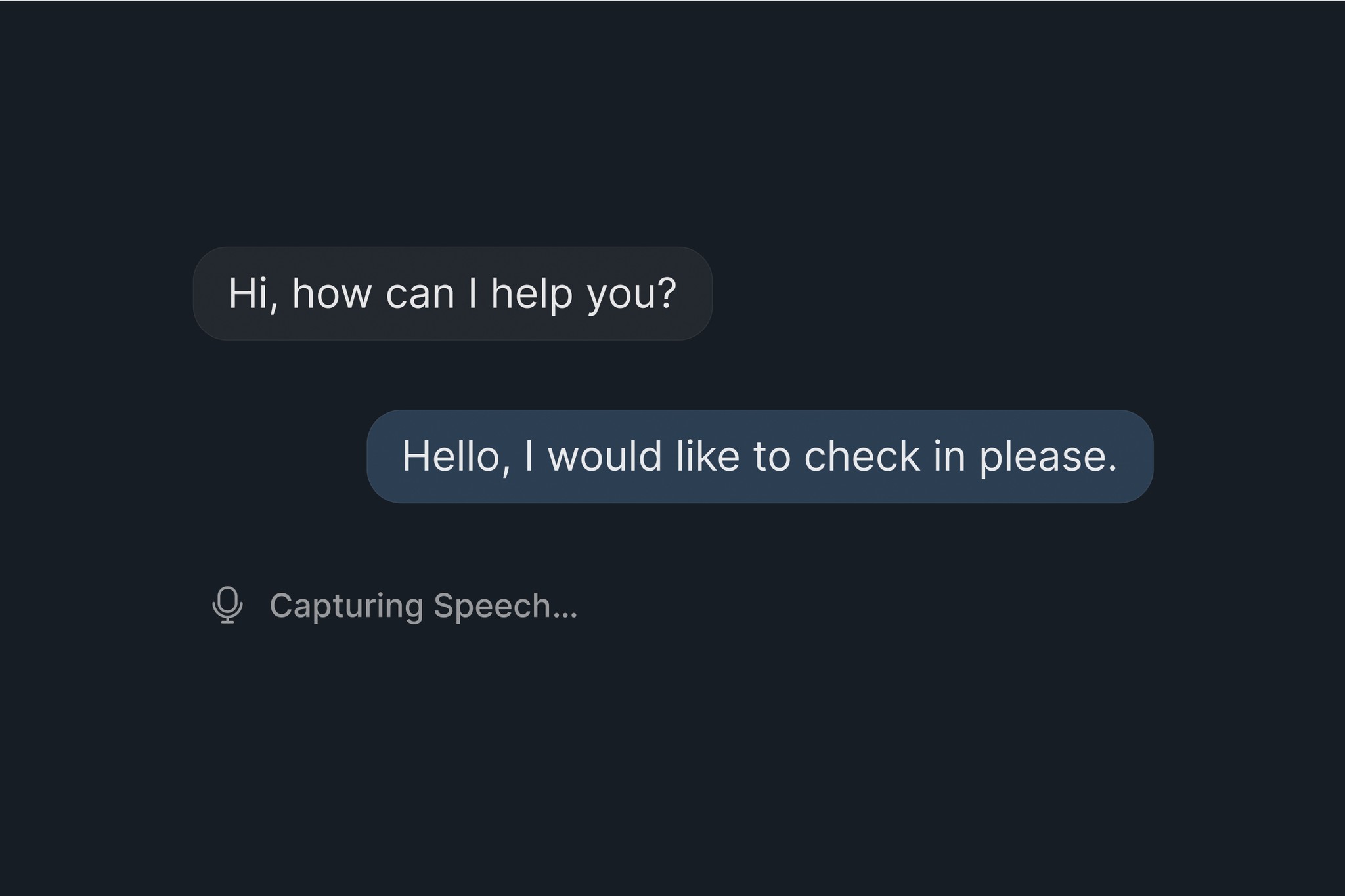
Experienced inconsistent, inaccessible interfaces, especially challenging for those needing higher contrast and larger text.
Our Team
I inherited the design system from a previous designer
While leading five products, I inherited the design system from a former designer and led its complete overhaul, auditing, redesigning, documenting, and rolling it out in close collaboration with other designers and engineers across the company.
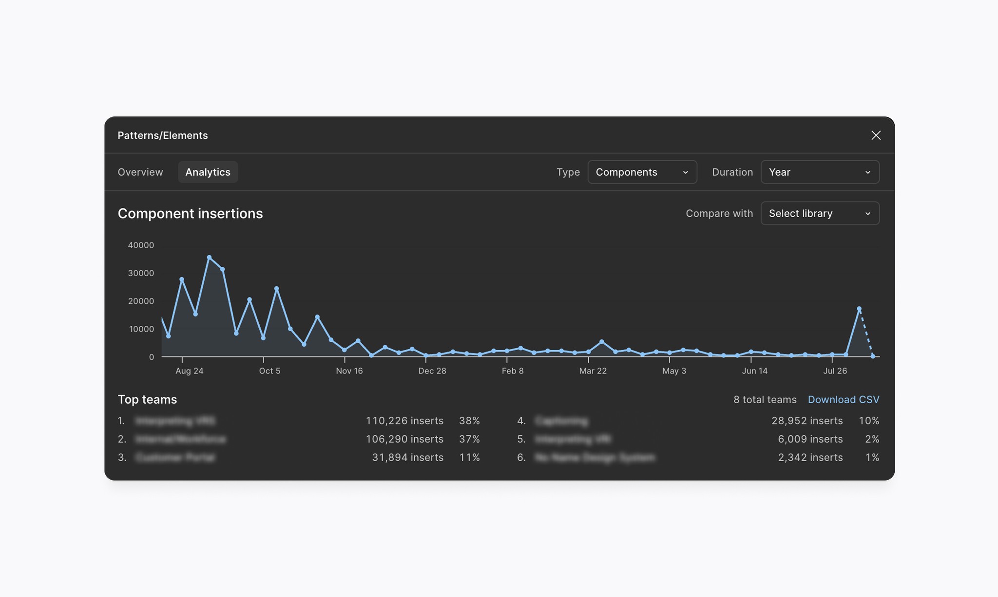
Research
Only 38% of existing components were being used
I began by auditing actual usage - pulling data from Figma and speaking directly with designers to understand what was truly needed.
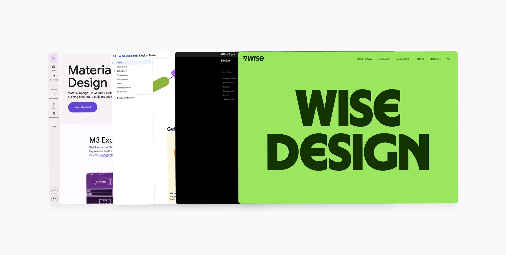
I also looked at other design systems like Material, Atlassian, Apple, and others to help define documentation patterns, accessibility baselines, and naming conventions.
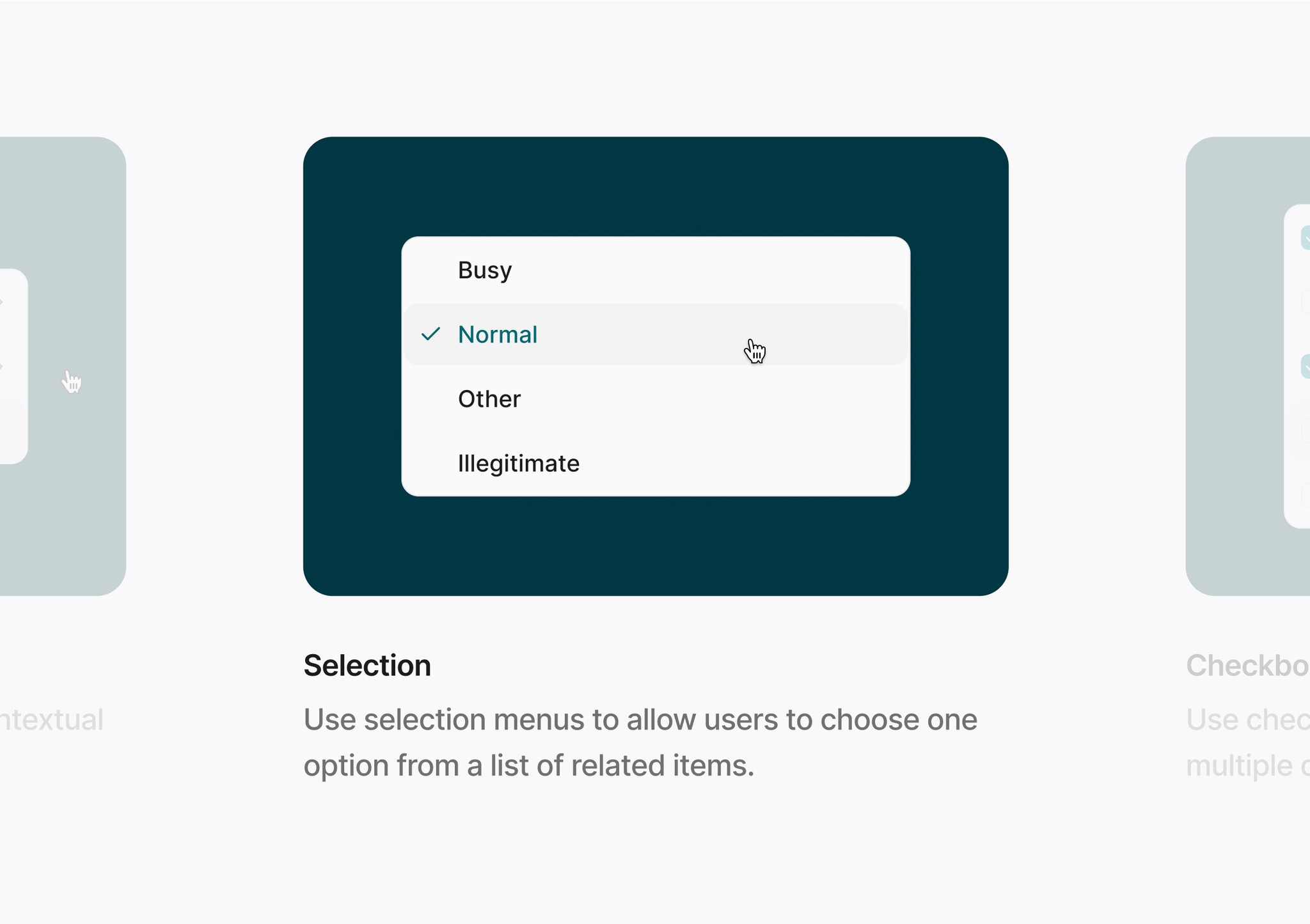
Design
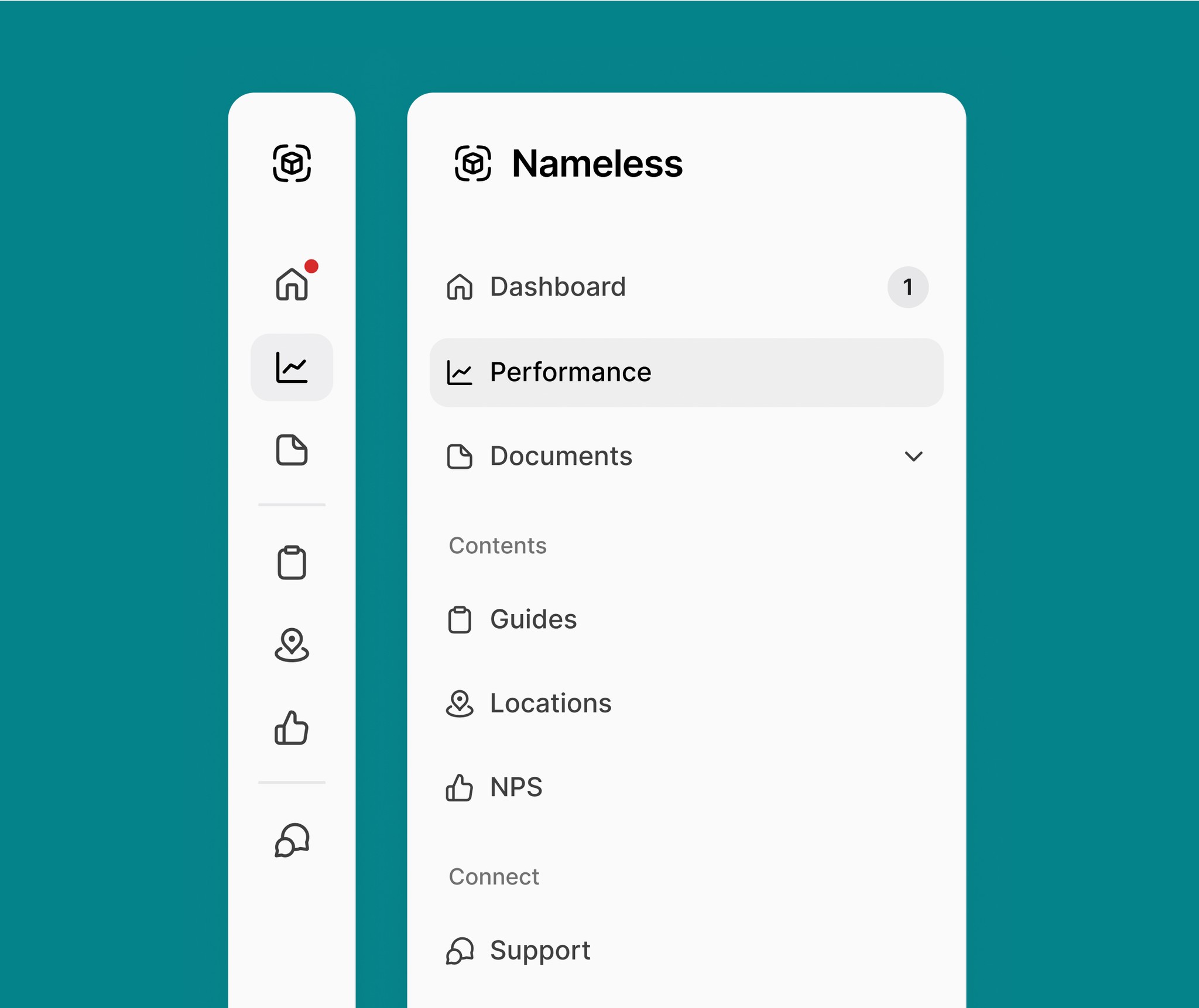
We reduced the system from 42 to 18 components
As a design team, we agreed to start with a simple MVP for the new system, focusing on the components teams actively used to maintain focus and avoid clutter.
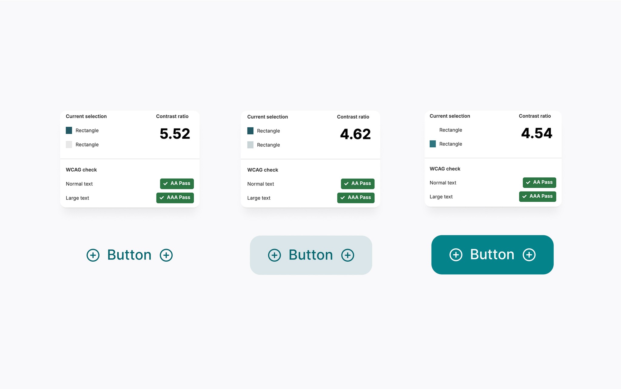
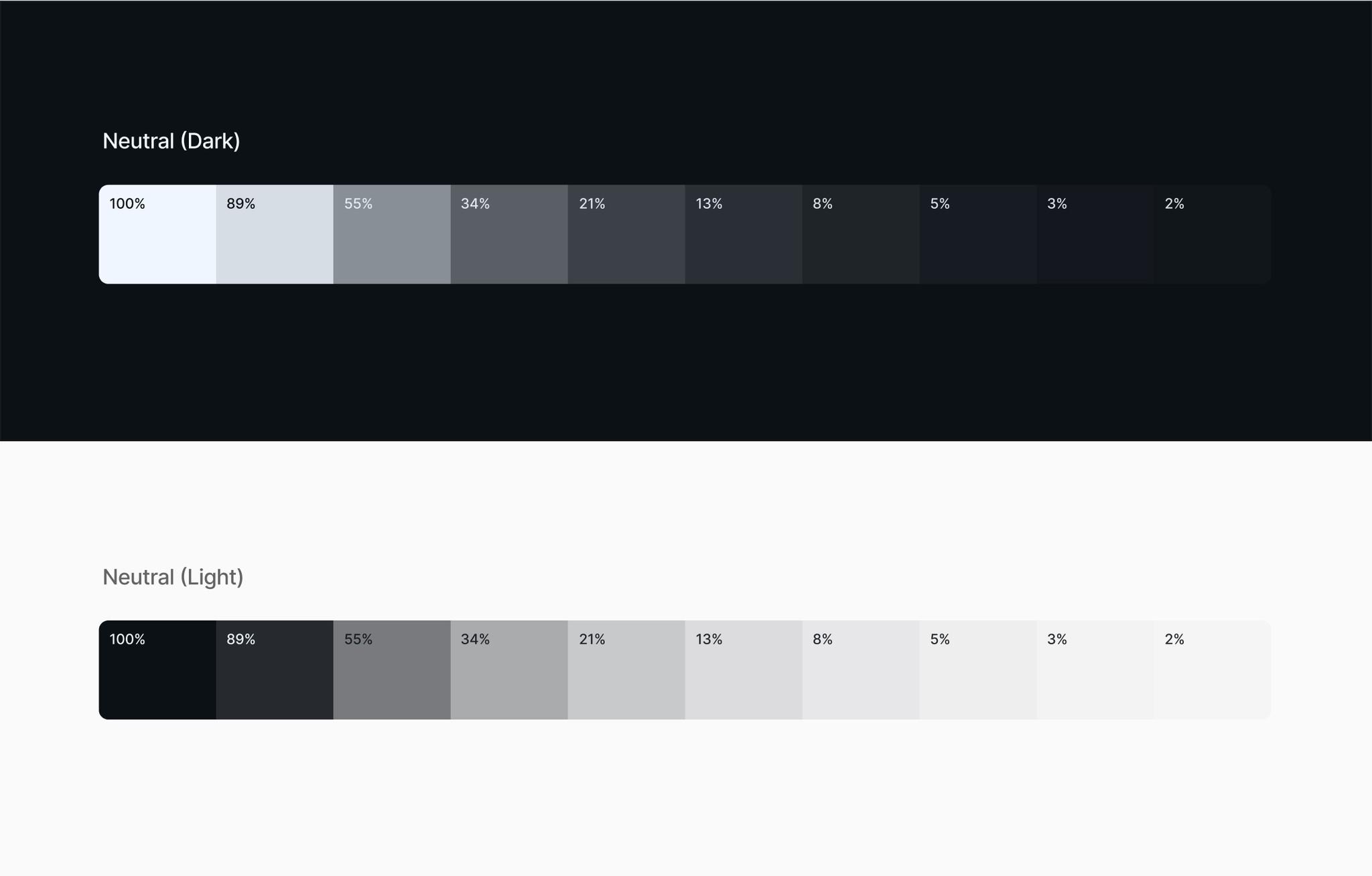
Finding colors that meet accessibility standards
Starting with our existing palette, I tested each color against WCAG 2.1 AA standards and for legibility across common color blindness types, improving the set, and adding new options for more variety in future designs.
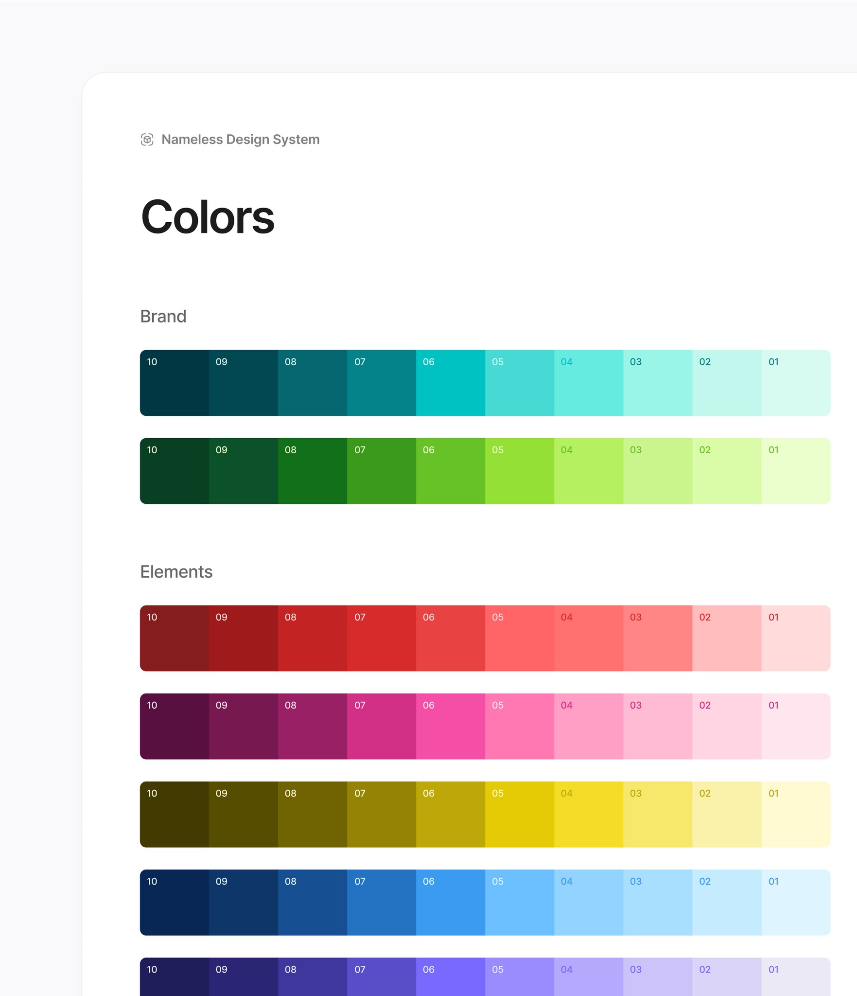
We moved to a translucent color model, which allowed UI elements to adapt to layered surfaces while maintaining consistent contrast. This reduced the number of colors we needed to manage, and made the system easier to scale, maintain, and apply.
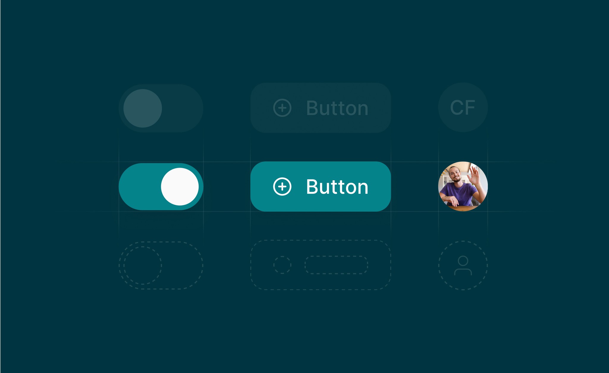
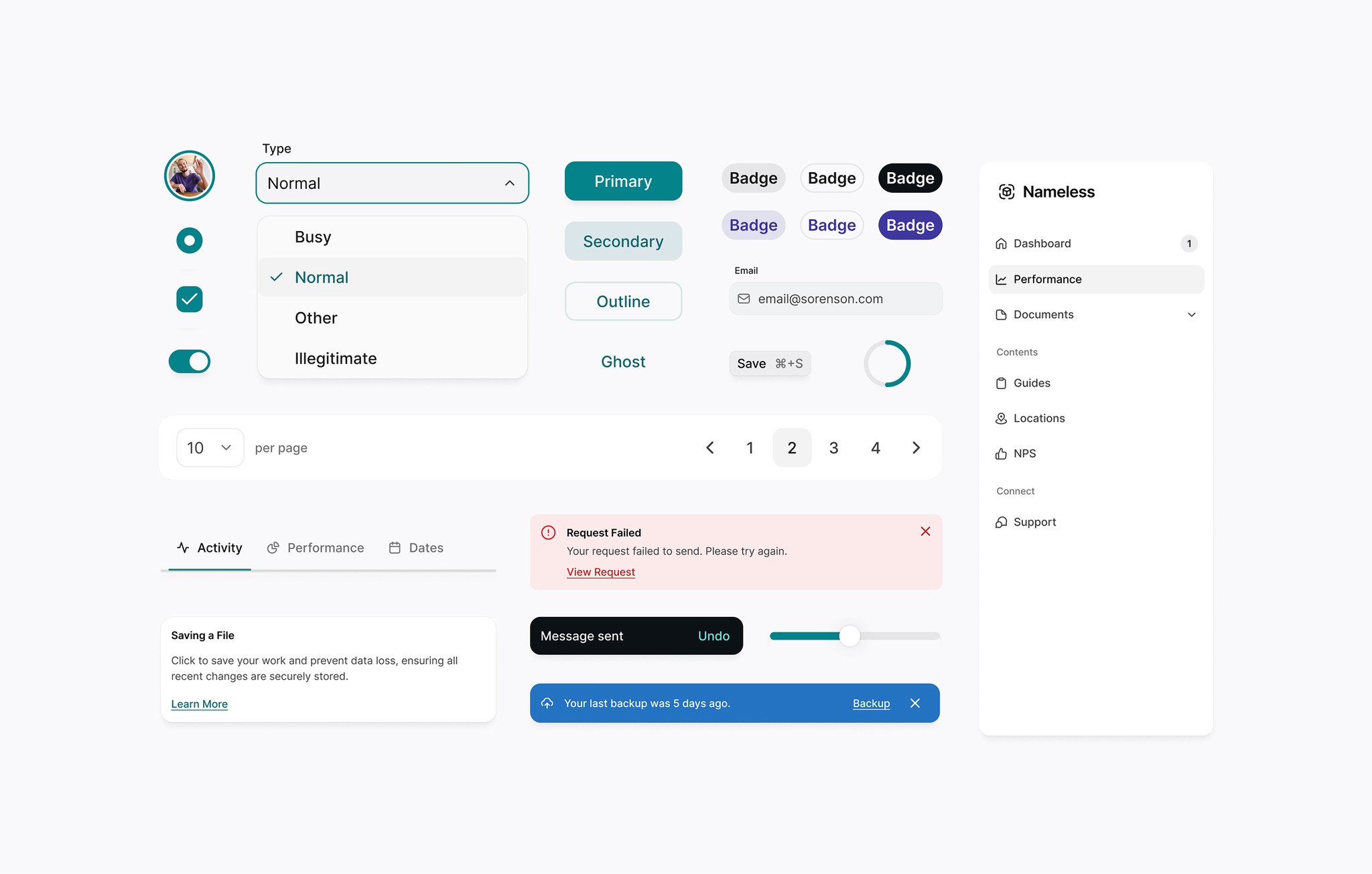
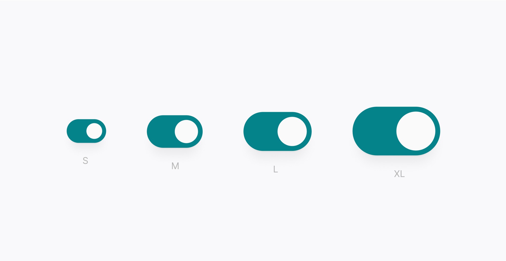
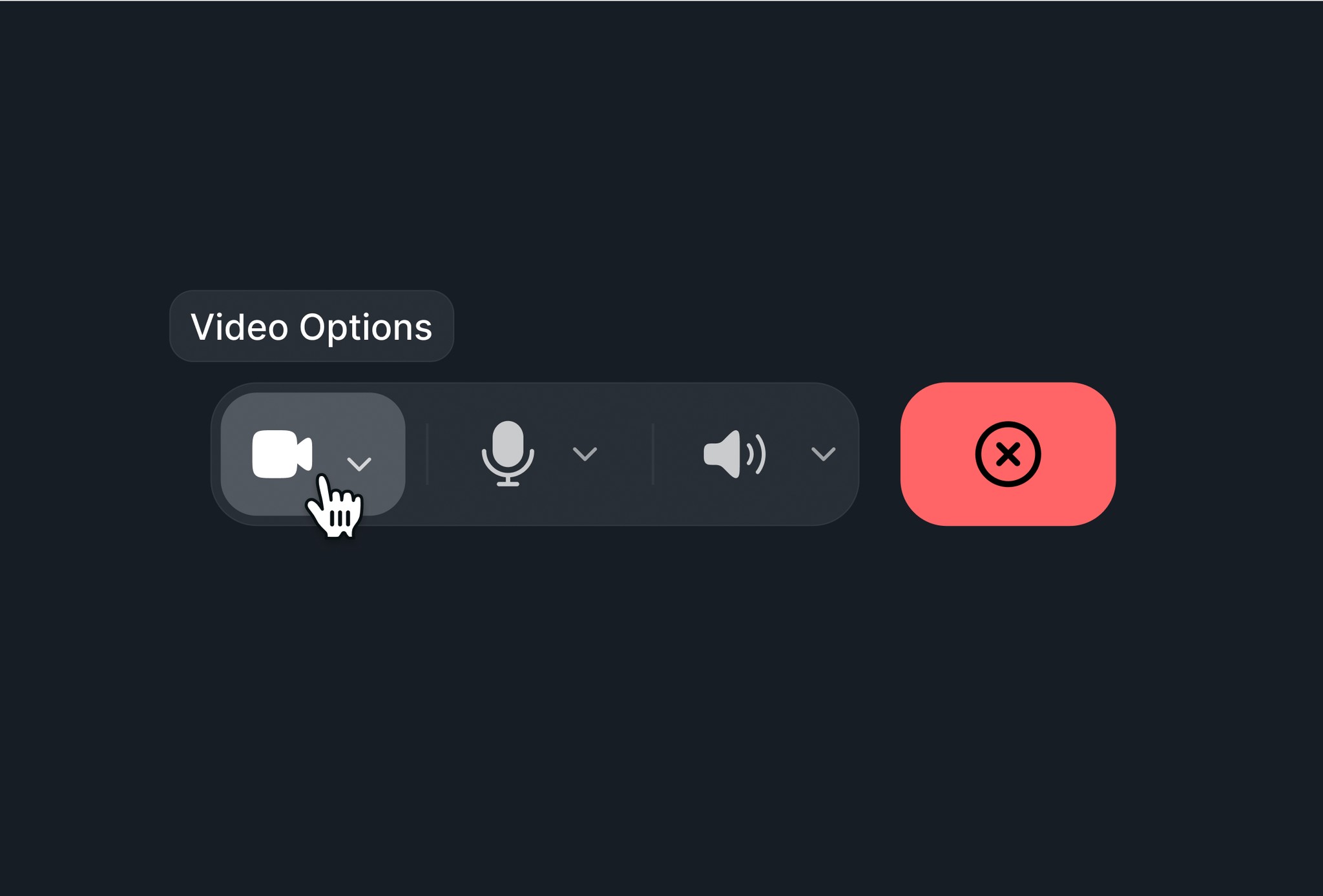
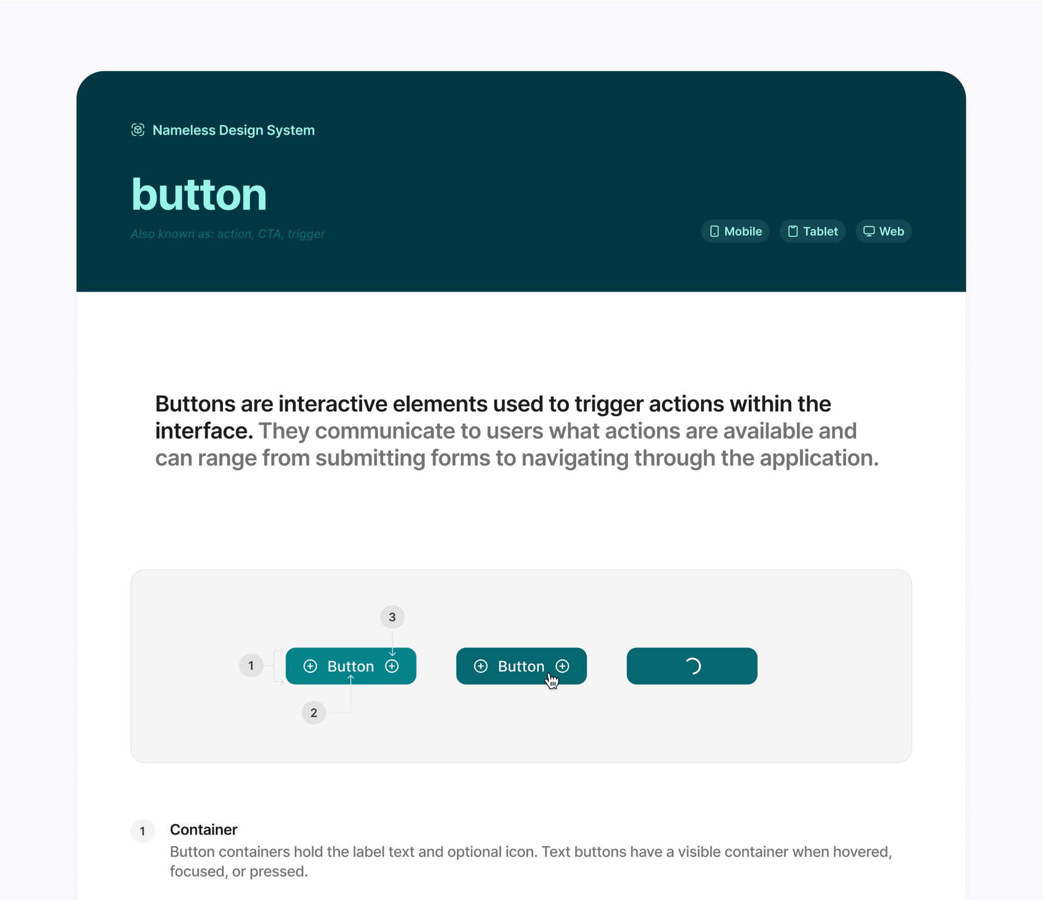
Building components that adapt to every device
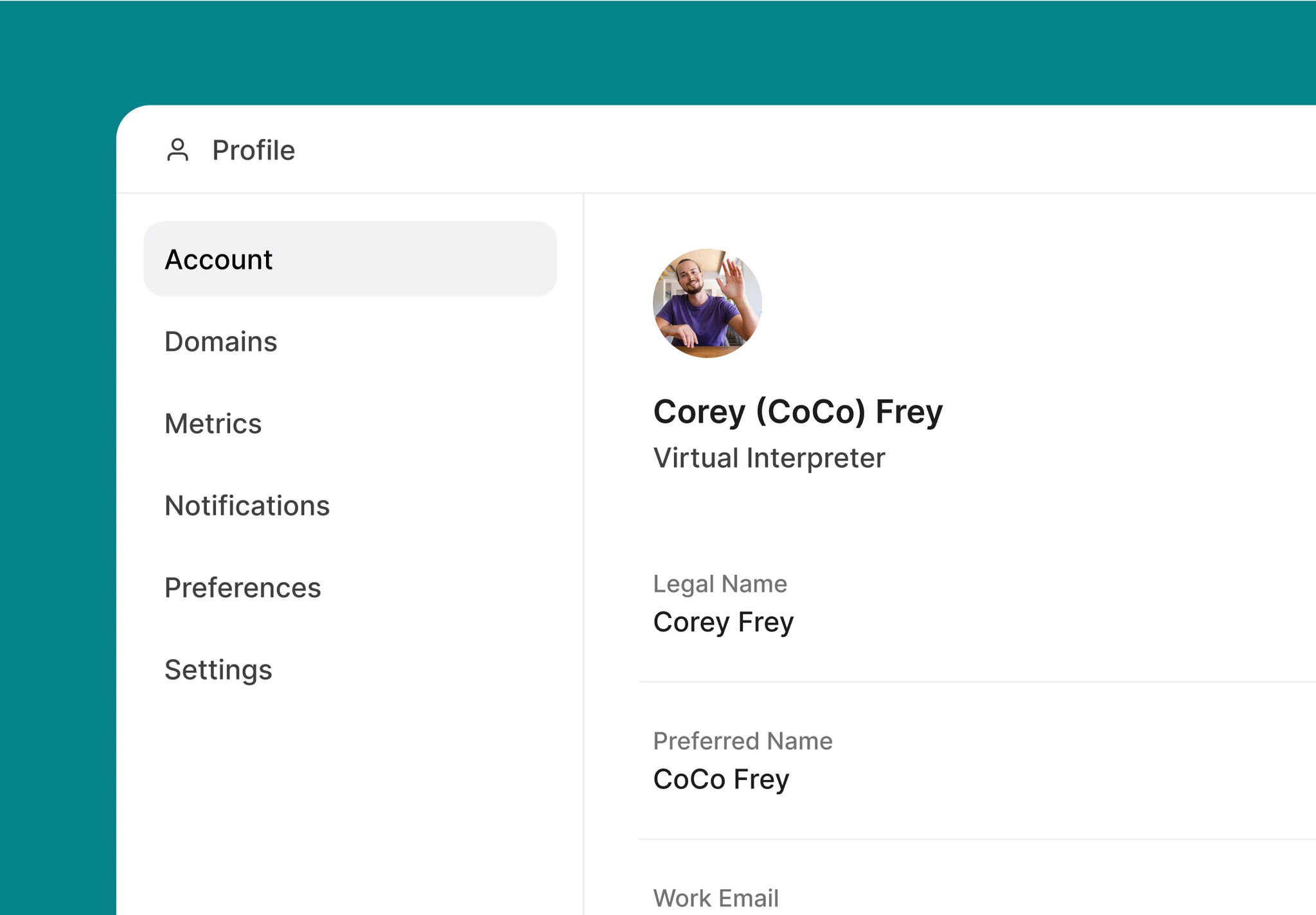
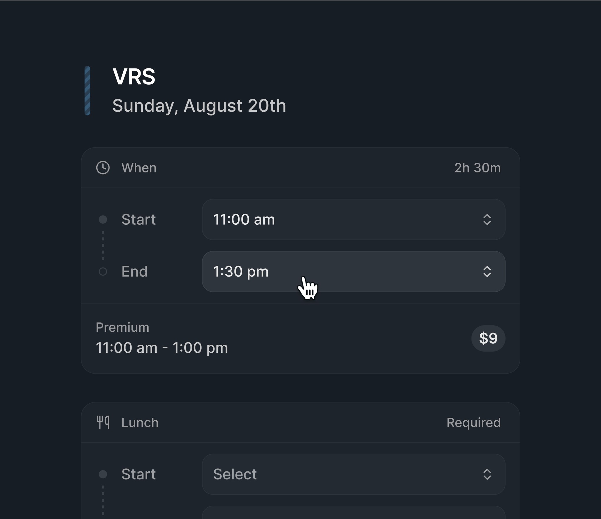
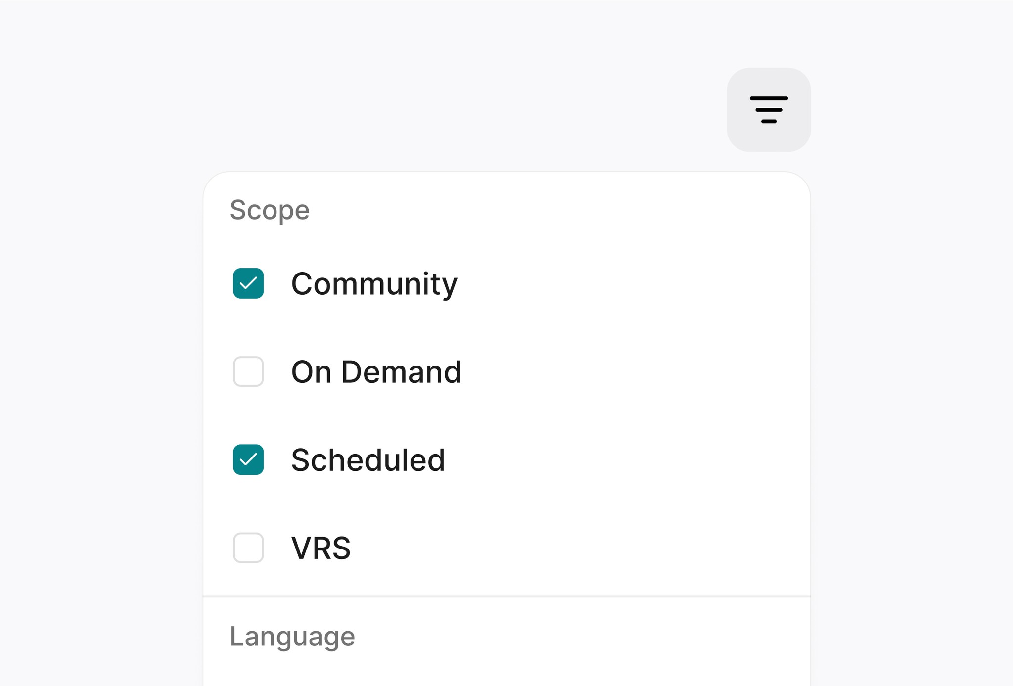
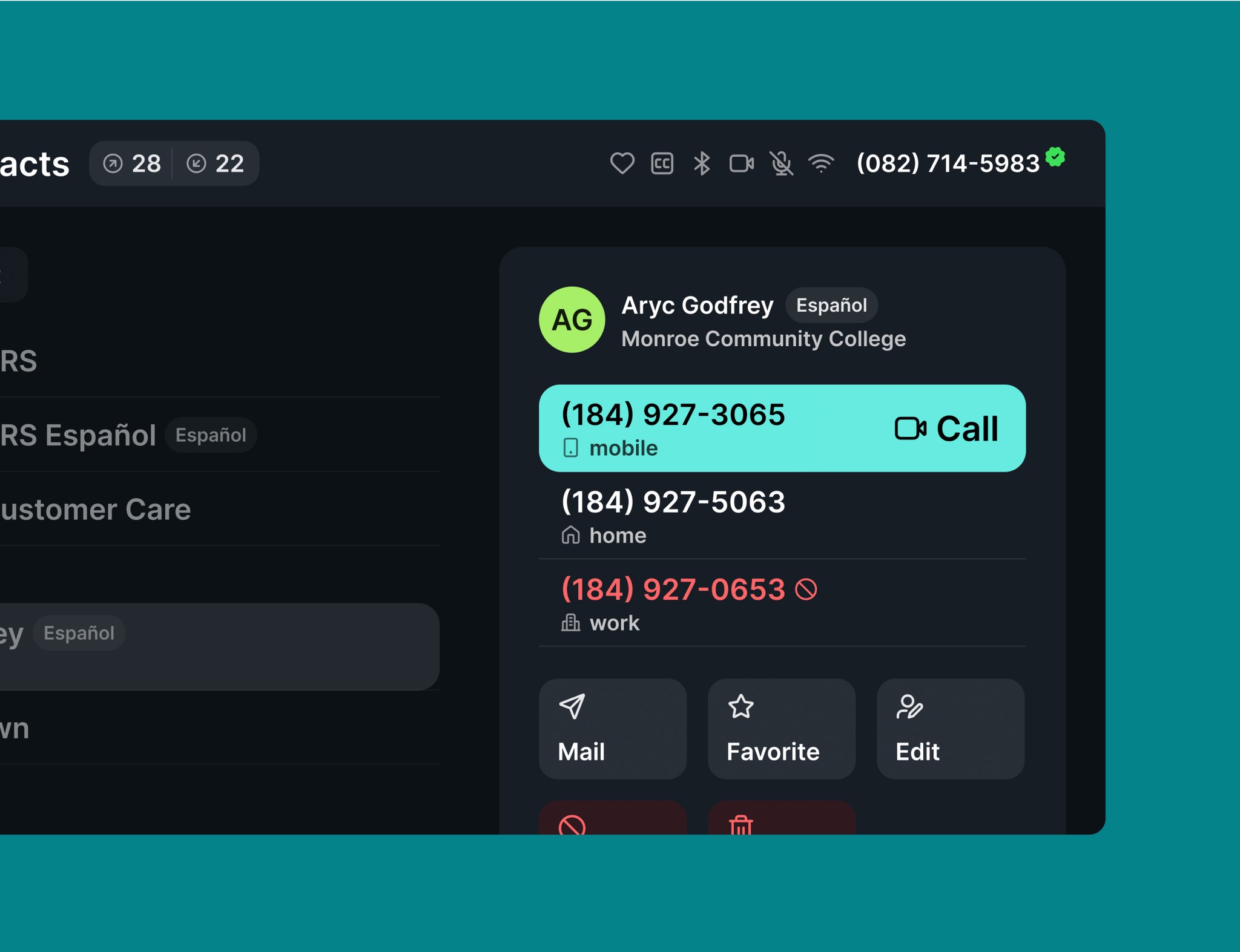
Once colors were locked, I began building components across different sizes. These mapped directly to product needs from mobile and web to TV - while making it easier for teams to support larger text sizes without overriding components.
Creating documentation to guide consistent use
When components were ready, I built out documentation in collaboration with designers, engineers, and PMs. Each component included anatomy, best practices, variants, content rules, and interaction guidelines. We prioritized real use cases and patterns we saw in current products to reduce adoption friction.
Testing
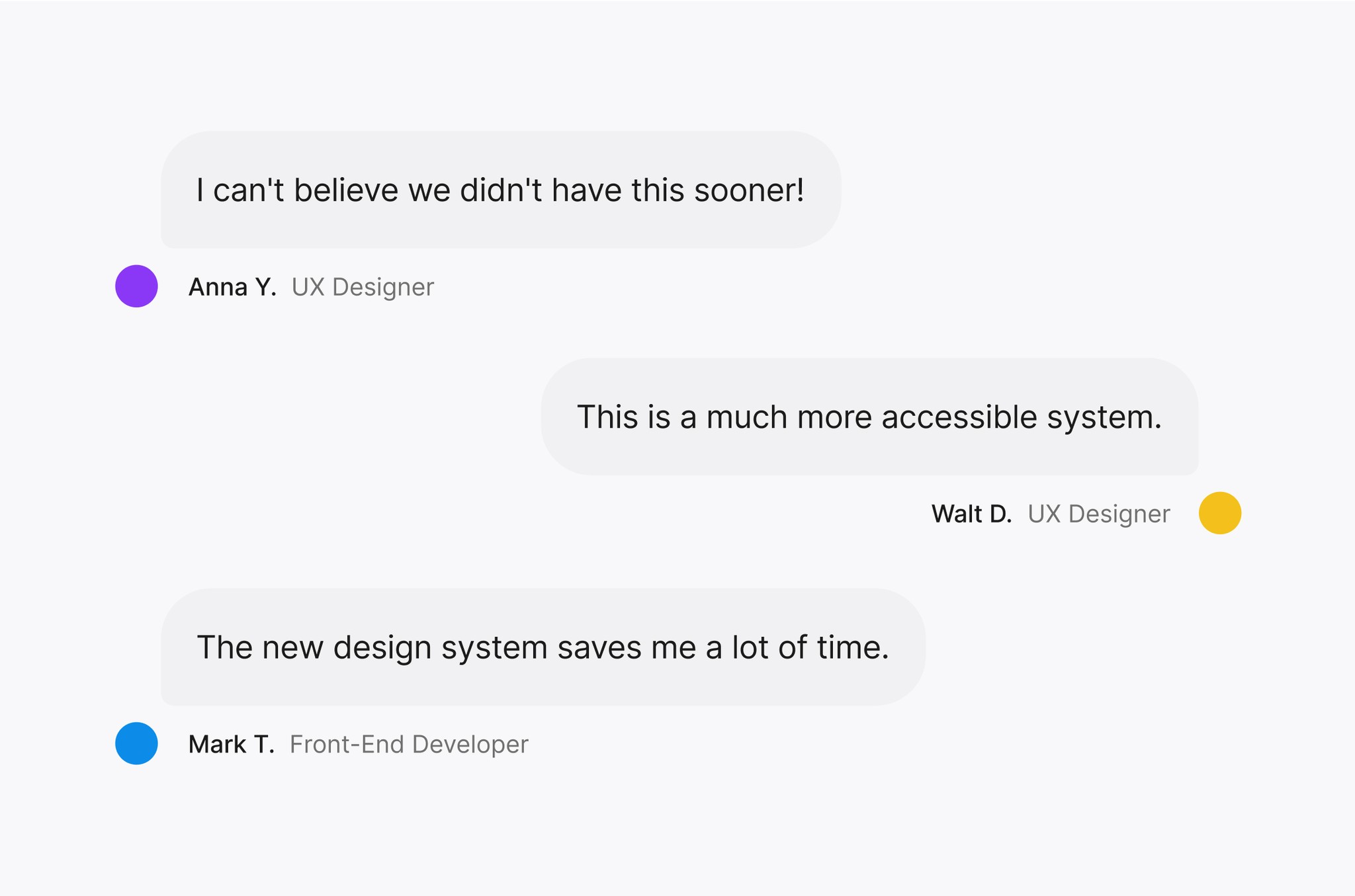
We introduced the design system into both active and upcoming design work
Since the new components aligned with what designers were already doing, but with more clarity and accessibility, it was a smooth transition.
Integration
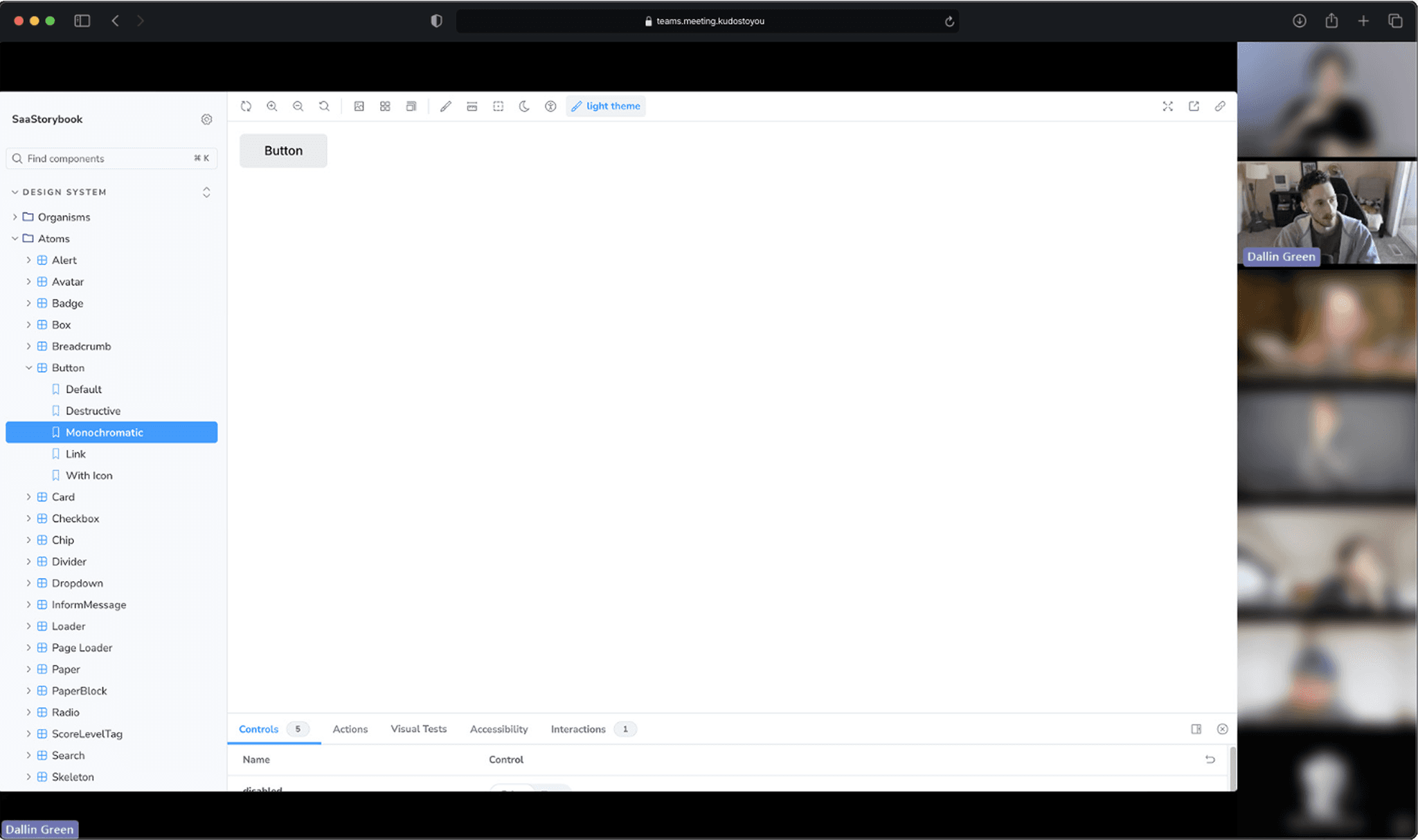
We waited to integrate with Storybook until teams had designed with the system
This gave us space to validate the components in real workflows, identify any gaps, and avoid costly rework in code. Once the foundation felt solid, I partnered with developers to begin implementation.
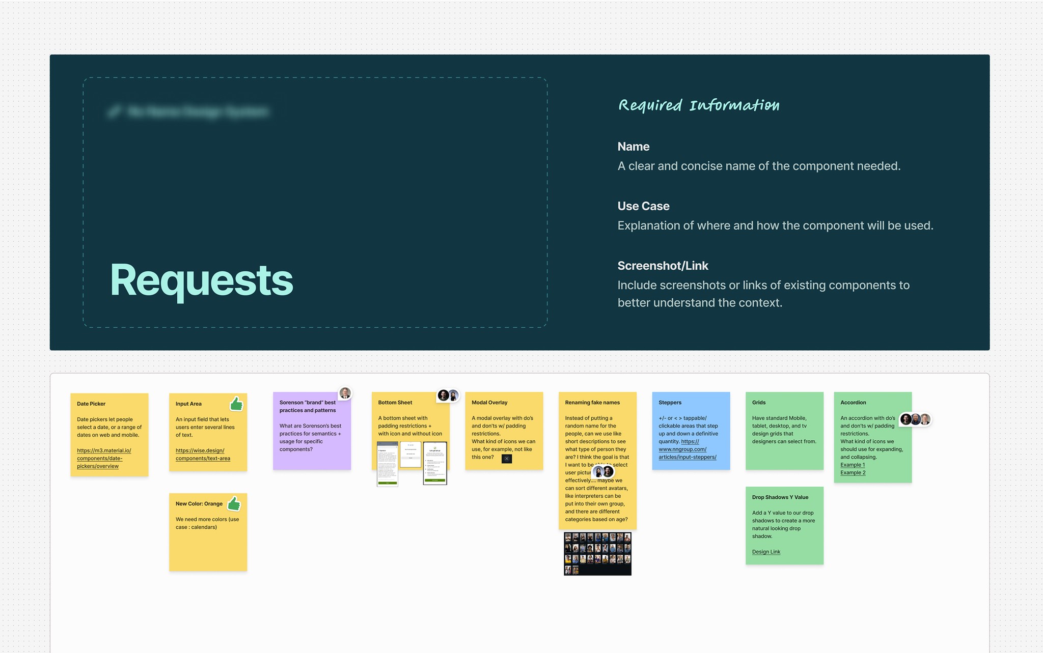
I created a request board for designers, developers, and product managers to propose changes
To ensure we’re consistently aligned, I meet weekly with developers and designers to review requests, align on updates, and keep the system consistent as adoption grows.
Results
Every designer is now using the new system
Engineering teams are beginning to roll components and tokens into production. Accessibility is built in by default, and teams have clearer documentation to work from.
Reflection
Design system work isn’t always seen as fun or exciting
It’s easy to get caught up in the UI instead of the impact on the people using it: designers, engineers, and end users. I approached this system like a product in its own right, with real users, clear needs, and measurable outcomes.
Seeing it reduce workloads, streamline collaboration, and raise the quality of our products has been deeply rewarding.